MTA Turnstile Data Analysis
The MTA’s publicly available data includes turnstile information that allows detailed analysis on ridership by station, date, and other category. However, the raw data below contains irregularities such as duplicate entries, so it takes some cleaning before the set can be useful.
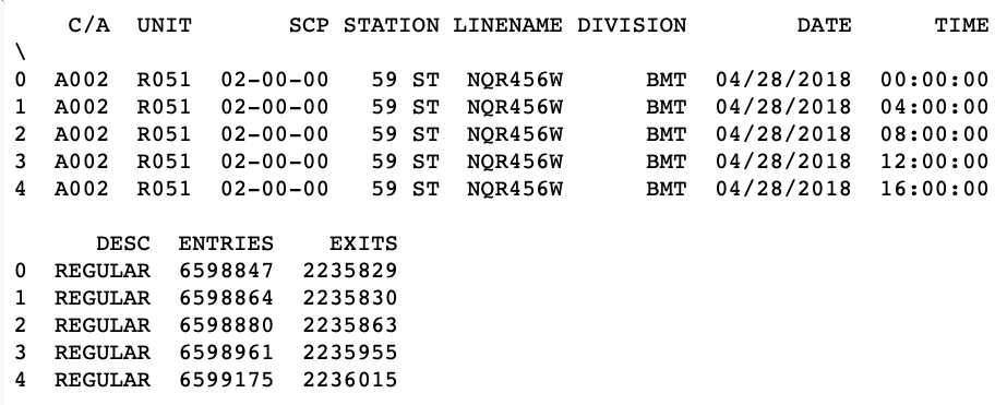
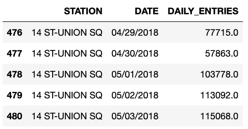
Although the data includes information on turnstile exit numbers as well, for this exploratory data analysis, we’ll focus on the entries. To find daily entry volume at each station, the combined number of entries from all turnstiles within a station is calculated, where each turnstile’s volume is accumulated over six 4-hour periods.
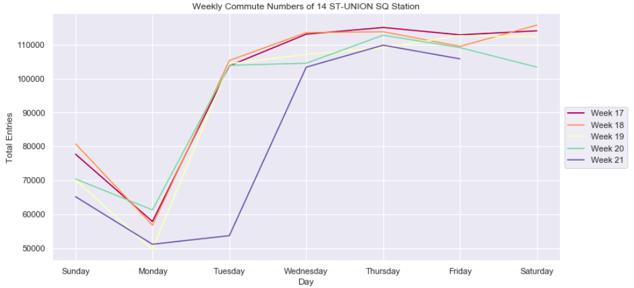
With entry volume by day, we’re able to see the ridership trend throughout the week, where typically Sunday and Monday have the lowest numbers, roughly showing less than half the volume compared with the rest of the week.
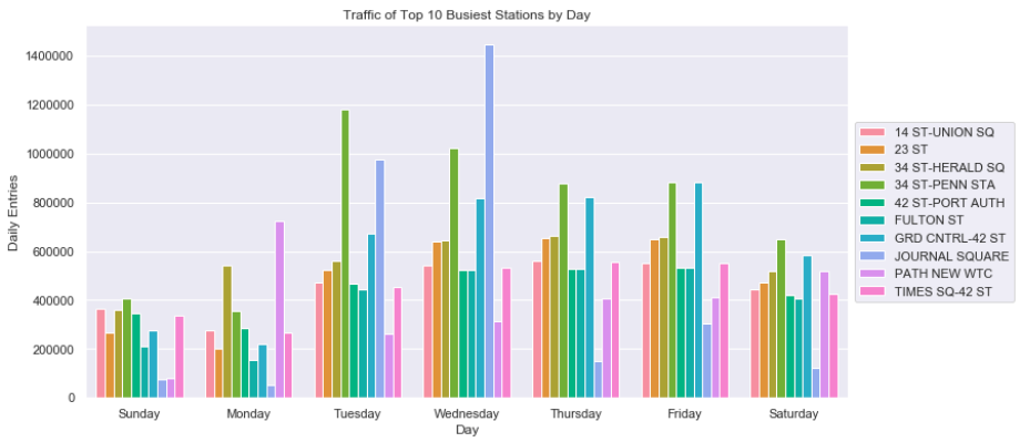
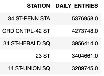
The combined entry volume by station also highlights the top 5 stations with the most ridership, which include: 34th St/Penn, Grand Central/42nd St, 34th St/Herald Square, 23rd St, and 14th St/Union Square.
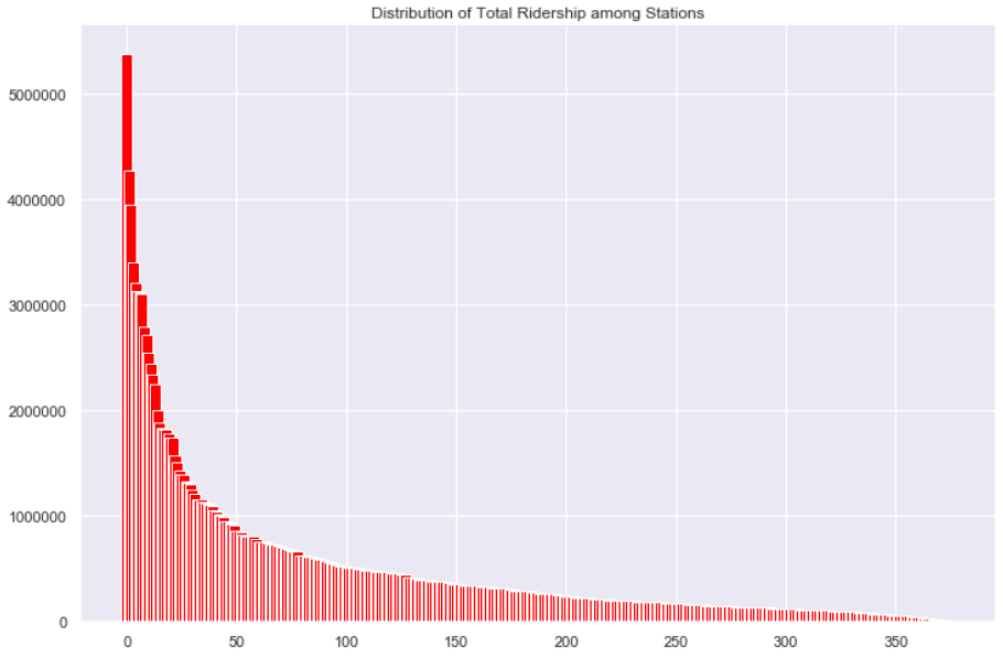
Finally, a histogram can show total ridership distribution as a stark contrast between the busiest stations and most average stations that have very low traffic.
Data source: MTA Turnstile Data
Tools
- Seaborn
- Matplotlib
- Pandas/Numpy